PREVIOUS POST
How Magazine Proofing Works Step by Step
If you have ever sent a layout to print feeling quietly confident, and then opened the printed copy thinking, “Why does my deep black look like warm charcoal,” you are not alone.
Proofing can feel like that awkward in-between space where your design is finished, but not yet safe. And in a way, that’s exactly what proofing is meant to be. A magazine proof is not a formality. It is your last calm checkpoint before thousands of copies lock in your choices.
Not just printing. Preserving your design’s intent. Let’s walk through how magazine proofing works, step by step, in a way that feels practical, human, and easy to follow.
What a magazine proof Actually Is
A magazine proof is a preview of how your magazine pages will look when printed, before the full print run begins. It helps you catch:
Colour shifts (skin tones, brand colours, blacks)
Text errors (typos, missing glyphs, overset text)
Layout issues (margins, bleeds, cut-offs)
Image problems (low resolution, banding, odd sharpening)
Finishing surprises (paper, lamination, varnish effects)
Think of it like tasting the curry before you serve it to guests. You are not doubting your recipe. You are protecting your reputation.
Why Proofing Matters More Than People Admit
Sometimes, creatives feel shy about asking for proofing because they worry it signals insecurity. But proofing is not insecurity. It is professionalism.
Print has its own personality. Screens are backlit and forgiving. Paper is honest and a little stubborn. Ink behaves differently depending on humidity, paper absorbency, and press calibration. A magazine proof is where you meet that reality gently, before it becomes expensive.
How Magazine Proofing Works Step by Step
Step 1: You Finalise the Print-Ready Files
Before proofing even starts, your printer (or production team) needs files that are properly prepared, usually as PDF.
This typically includes:
Correct page size and trim marks
Bleed (often 3 mm, depending on printer specs)
Safe margin for text and logos
Images at proper resolution (usually 300 dpi at final size)
Fonts embedded or outlined (as required)
Correct colour mode (generally CMYK for print)
If something is off here, the magazine proof will reveal it, but it is better to begin clean.
Step 2: Preflight Checks Happen
Preflight is a technical check to catch obvious issues before making the proof.
The team checks things like:
Missing fonts
RGB images sitting inside a CMYK workflow
Transparency problems
Low-resolution artwork
Incorrect bleeds and page boxes
In a way, preflight is like checking your camera settings before a paid shoot. It saves embarrassment later.
Step 3: Colour Management is Applied
This is where many surprises begin.
Most professional proofing uses ICC profiles. These profiles act like translators between:
Your screen colour space
The proofing device
The final printing press and paper
If your printer is serious about colour, they will match the magazine proof to a defined print standard or their press profile. That is how your brand red stays your brand red, not “almost red”.
Step 4: The Proof Type is Selected
Not all proofs are the same. This is important.
Common types you may hear about:
Soft proof: you review on screen, often with colour simulation
Hard copy proof: a printed proof on a calibrated proofing printer
Contract proof: a colour-accurate hard proof meant to predict press output
If colour accuracy is critical, push for a hard copy magazine proof that is calibrated and referenced to a press profile. Soft proofs are helpful, but they can be a little optimistic.
Step 5: Imposition Happens (Behind the Scenes)
This step is invisible to most designers, but it matters.
Imposition is how individual pages are arranged on large sheets for printing and folding. Your Page 1 may not sit next to Page 2 on the press sheet. It is like how a saree is folded in a shop. It looks complex until you understand the logic.
Imposition affects:
How spreads align
How creep shifts inner pages in thick magazines
How trims and folds behave
A good magazine proof helps you spot issues like misaligned crossovers or important text drifting too close to the gutter.
Step 6: You Receive the Magazine Proof for Review
Now comes your part, and this is where calm eyes matter. When you receive the magazine proof, do not review it like you are scrolling Instagram. Review it like you are protecting your name.
A simple approach that works:
First pass: overall look and feel
Second pass: text, captions, page numbers, credits
Third pass: images, skin tones, gradients, blacks
Fourth pass: margins, bleed, alignment, crop safety
If possible, review under neutral lighting. Warm indoor lights can make whites look creamy and blues look dull.
Step 7: You Mark Corrections Clearly
Corrections should be unambiguous.
You can:
Annotate on a PDF using comments
Mark a physical proof and scan it
Create a structured correction list (page number, issue, fix)
Keep it clean and specific. Instead of “image looks off,” say:
“Page 12: reduce magenta cast on skin tones”
“Page 18: headline too close to trim, move 4 mm inward”
“Page 27: black background appears washed, confirm rich black build”
This is where the magazine proof becomes a real communication tool, not just a sample.
Step 8: Printer Updates Files and Generates a Revised Proof if Needed
If corrections are significant, you may get a second magazine proof. This is normal. Proofing is not a one-shot exam. It is a feedback loop.
Small typo fixes might not need another full proof, depending on timelines. But anything affecting colour, layout, or multiple pages usually deserves a revised proof.
Step 9: You Approve the Magazine Proof for Press
Approval is serious because it becomes the reference. Once you sign off, the printer runs the job based on that approved magazine proof.
In many print workflows, this is called “proof approval” or “OK to print”. It is essentially you saying, “This is the standard we are committing to.”
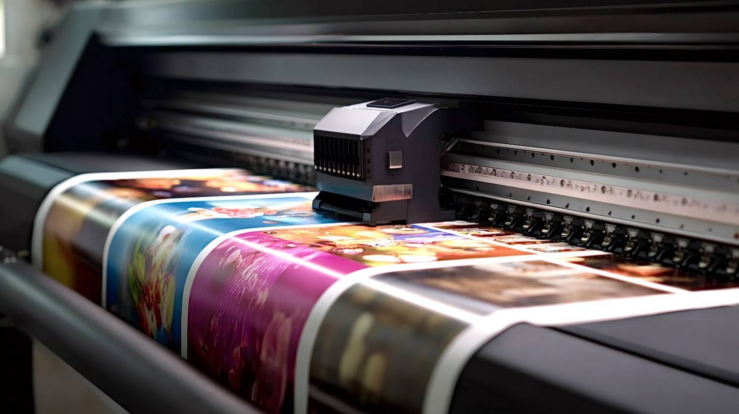
Step 10: Press Checks and Final Print Run
On press, the printer matches the output to the approved magazine proof, adjusting ink density and balance.
Even then, paper and press conditions can vary a bit. But the proof gives everyone a shared target, like a compass. Printing with a trusted partner like Photostop.in ensures that your approved proof is faithfully reproduced, maintaining colours, layout, and quality exactly as you intended.
A Quick Checklist for Reviewing Your Magazine Proof
If you want one small list to keep beside you while proofing, use this:
Are all images sharp at 100 percent zoom on PDF
Do skin tones look natural, not too pink or too grey
Are blacks rich and consistent across pages
Are brand colours matching your reference
Are headings and page numbers consistent
Are margins and bleeds correct on every page
Any text too close to trim or gutter
Any missing elements, icons, or background shapes
Leave a Reply
Your email address will not be published. Required fields are marked *